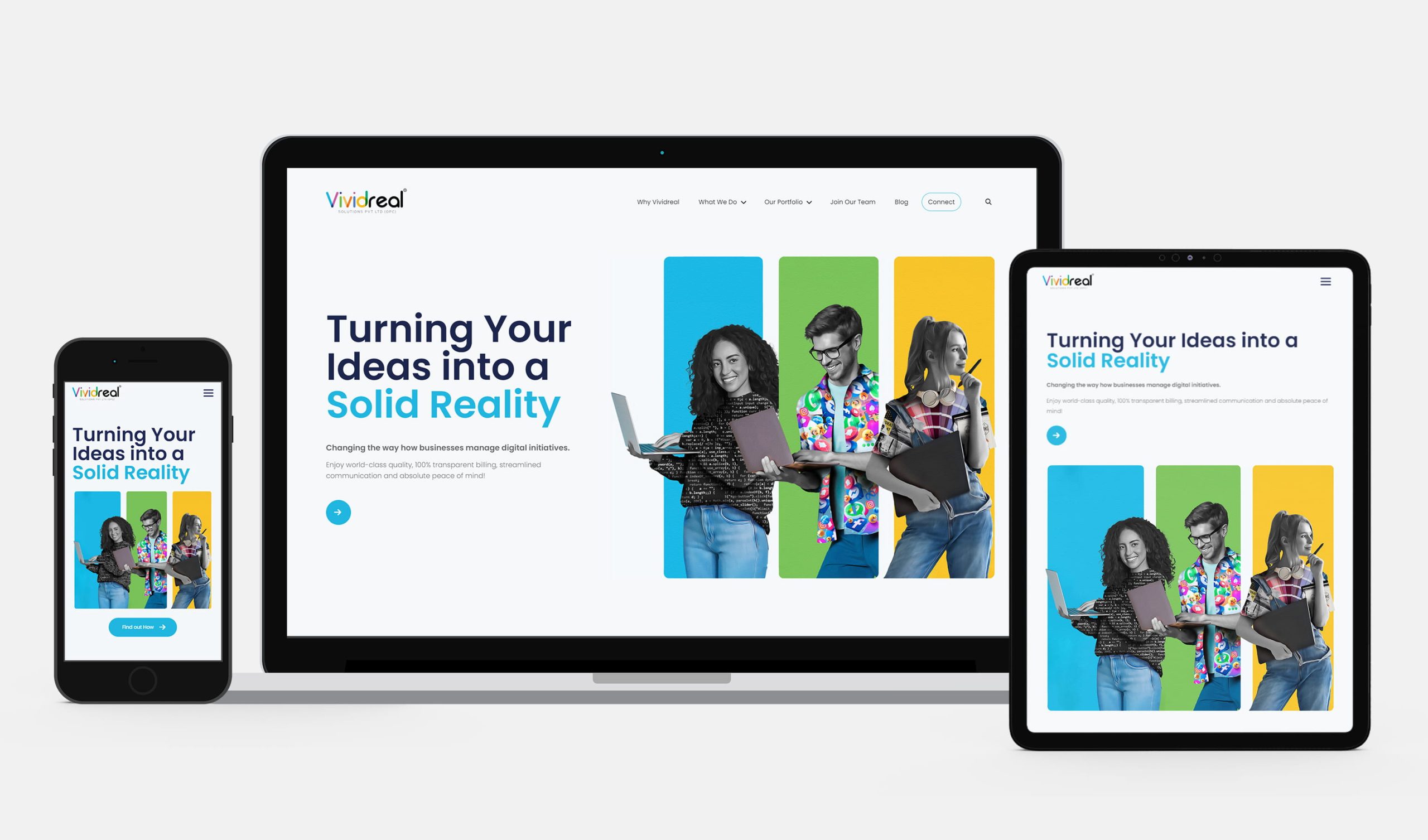
How conversion oriented are your landing pages?

Have you ever clicked on an ad that took you to a totally unrelated page? Of course, it has happened to almost everyone online. Do you remember that feeling of frustration? This is the feeling your customers might get if you do not use a proper landing page for your ads.
Newbie marketers make the mistake of directing the customers from their ad to their website homepage. This is not an effective strategy. Most websites have a conversion rate of 1 to 3 per cent on an average. If you are sending your customers to your website homepage, you are going to lose a lot of potential customers.
On the other hand, a well optimized, conversion-oriented landing page normally has a conversion rate of up to 15 per cent. If you have a properly designed landing page for your lead generation ads, you will be able to get your message out to a greater number of your potential customers.
Before we move on, if you need any kind of help with landing page design and development, you should definitely reach out to us. Check out our team. Let’s talk.
Here is how you should design a landing page for optimum results.
Include the Following Elements in Your Landing Page
- A heading that captures the attention of your customers
- A brief description of what you offer
- A relevant image or video
- Trust elements like testimonials, customer logos or security badges
- Have a form in your landing page itself to collect the information you need. If you can’t include a form in your landing page, make use of a good call to action that grabs your reader’s attention.
Your Landing Page and Your Ad Must Have Similar Content
Your customers might be coming from your PPC ads, email campaigns or social media campaigns. Make sure that your landing page gives out the same information your ad/email did. For example, if your email said ‘Free ebook download’, your landing page must say the same or must convey a similar message.
Make separate landing pages for each ad or emails. The more landing pages you have, the more are your chances of converting the traffic into leads.
Keep Your Design and Copy Simple
It is better to make your landing page minimalist in design. Use your brand colors so that your customers can identify you. Do not use any flashy design or drive your customer’s attention away from your objective.
Many marketers make the mistake of focusing only on design and overlooking copy. You need to be very careful in writing the copy. The copy is what tells your customer what to do on the page. Make your copy short and simple so that your customers know what to do when they land on your page.
Your Landing Page Must Have Only One Main Function
Your landing page must be action focused. May it be for the subscription to your newsletter, ebook download or selling a product. The objective of the landing page is to make your customers perform only one particular action. Every aspect of your landing page must lead your customers to make that intended move.
Ask for Only the Essential Information
Even though it is nice to have a lot of information, most people do not have the patience to fill out a very long form. Some people might not feel comfortable sharing that much information with you. Try to strike the balance of asking for enough information from the users without making them feel uncomfortable.
Make Your Call to Action Effective
The call to action button must be clearly visible on your landing page. Use a distinctive color to highlight it. All the other elements in your landing page must work towards motivating the visitor to click on your call to action button.
The positioning of the call to action button is of great importance. Some suitable positions are :
- At the beginning: so that people will notice it at first glance.
- At the end – As it is very common in web page designs, many people expect the call to action at the bottom of the page.
- Right after making the most important point in your copy.
- A Call to action that floats; A button that keeps floating and is always visible on the page.
Use A/B testing to determine which position, colors and fonts work best for you.
Avoid Unnecessary Navigation on the Landing Page
You have succeeded in bringing traffic to your page. Do not let your customers wander off to other pages. Limit navigation buttons on your landing page. Make them perform the action you want them to make by keeping them on the page.
Make Use of Trust Symbols and Testimonials
Use trust symbols like customer logos and security badges to make your visitors feel safe. One of the best ways to attract new customers is by showing them social proof. You can also make use of your customer testimonials and recommendations.
If your product or service have received positive comments on social media or customer review website, display them on your landing pages.
Optimize for Mobiles
While designing your landing pages, optimize it for mobile. A major chunk of people uses their mobile devices more than their laptops or desktops.
If you do all these, you will see a lot of traffic converting into leads. Make sure you use A/B testing to find out what features works best for you and use them in your landing pages.
As always, feel free to reach out to us if you need any help with landing page design and development. That’s all for now, cheers!


