Minimalism is an extreme form of abstract art that developed in the USA sometime in the 60s. Frank Stella was one of the first artists who experimented with minimalism. Her “Black Paintings” were exhibited at the Museum of Modern Art in New York in 1959, which were nothing like the paintings of the previous generation.
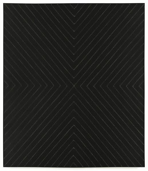
A minimalistic approach to web design seeks to simplify user interfaces. By removing unnecessary elements, a website can be made to look minimalistic.
Achieving Minimalism
Here are some key points to keep in mind when you are trying to achieve a minimalistic look.

The space between elements in a composition is known as whitespace/negative space. There are numerous benefits of using whitespace correctly. It is mainly used to divert attention to the webpage content or your product. Ample use of whitespace is necessary to add a balance to your design. Proper use of whitespace can captivate your visitors and make them spend more time on your website. Whitespace is one of the most important elements of a minimalistic website.
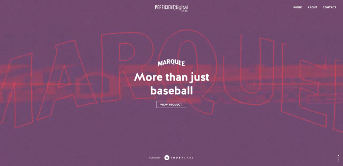
Most websites use flat designs and textures to promote a minimalistic feel. This may also include the use of ‘ghost buttons’. Although flat ghost buttons have legibility issues and look rather unconventional. You can add animations to the buttons that activate once the mouse cursor hovers above it.
Monochromatic Color Palette and Bright Colours
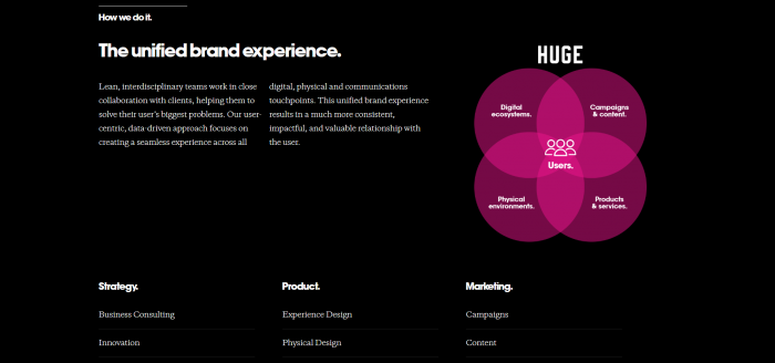
On most sites promoting minimalistic designs, colour is used strategically to guide attention without the use of any additional design elements. Implementing bright colours in minimalism can prove to be tricky. Use of too much colour can end up being irritating. You want a colour palette that looks pleasing, you don’t want your visitors feeling dizzy.
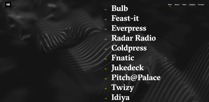
In a minimalist web page, images and animations can sometimes be very sparse. To make up for this, you can use fonts. The right fonts can make up for the missing elements. Efficient use of typography can make your website visually attractive. Fonts also help guide visitors, guiding them to what’s important. Sans Serif fonts are considered a great choice for minimalistic designs because of how clean they look.
Divide the text into blocks
Divide your text into blocks instead of presenting visitors with a wall of text. This helps them perceive the text better. It is a good idea to group similar information in blocks. The more pieces of information you add, the more difficult your website will be to understand and navigate. Walls of text will harm the minimalistic vibe you are trying to create.
Navigation
When removing unnecessary elements to get a minimalistic design, navigational elements may also get compromised. It is advisable to keep the menu bar as it is and include the other buttons inside it. This minimises the total number of navigational buttons, giving your website a cleaner look. You could animate the buttons as the cursor hovers above them to make sure the users know that they are clickable.
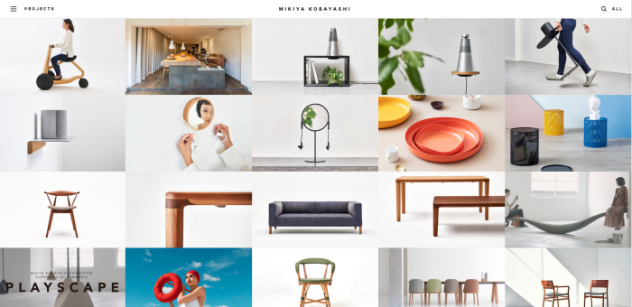
Use large high definition images that can sprawl across your webpage if needed. These can be pictures of the product you want to sell as well.
Minimalism has been one of the most popular design approaches for a long time. And it will continue to be so. Since it is an unconventional approach, designers and clients both love it. Though it may look simple, minimalism is far from it. It takes a lot of effort to balance minimalism and functionality. Although a website should appear minimalistic, it should still be user-friendly. If you want to stay updated on more website trends, check out our article on web design trends to look out for in 2020. If you’re looking to get a stunning website of your own, we can help with that. Click here to know more.

Facebook Comments